Second Teachers' Workshop: Visualizations
In this session, we focused on importing data into the program Orange Data Mining, integrating different data sources, and visualizations.
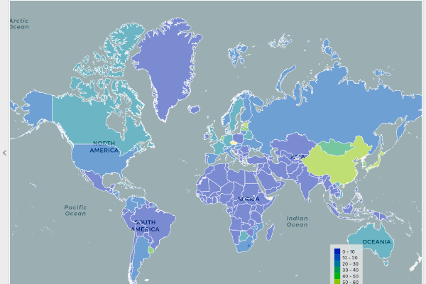
We were using the data from the HDI1 dataset, which we were already familiar with from the previous lessons. The data was reduced to the extent that it was easier to analyze. We prepared the data table in Excel and imported it into Orange. We also prepared a data table on religions in each country, and learned how to integrate two datasets based on a specific key – in this case country name.
The most time was spent on getting to know different types of visualizations and how they can be used to explore data. Because most of the visualizations in Orange are interactive, we can explore data by simply clicking on a visualization, i.e. graphic representation of data, and the widget will send the selected data to the output. We also used the Data output, which exported the full dataset with all the information about whether the cases in the visualization has been selected or not.
At the end of the session, the participants needed to explore the data to find interesting information about the world. One participant discovered this interesting fact: in the United Arab Emirates, women on average go to school longer than men.
Data from the World Bank, 2016. ↩︎