First Teachers' Workshop: Clustering
There are many countries in the world: Slovenia, Austria, Ireland, Greece, New Zealand, Cameroon, and nearly 200 others. Some are quite similar, like Slovenia and Austria. Well, at least compared to the similarities between Ireland and Cameroon.
But what do we actually mean when we say similar? It depends. You could say that countries where the same sports are popular are similar to each other. Or the same (non-)alcoholic drinks. Countries that have the same species of animals. But for the first teacher workshop, we compared countries based on more conventional data: for instance socio-demographic data, which the World Bank collects for the purpose of calculating the Human Development Index. For each country, the index records the number of years, on average, that its inhabitants have spent in school, the rate of unemployment, how much people earn, how many pensioners there are, and how many doctors, the number of women in parliament, and the average lifespan (of women, men, and both categories combined) measured in years.
When you have such excellent data, you can’t help but start spinning it up in a programme like Orange. In the first workshop, we calculated the similarities between countries (we didn’t actually spend much time on this, different ways of calculating similarities were discussed moore extensively in supplementary material), and then we learned about the process of hierarchical clustering.
Clustering is the collective name for various methods that can group data (people, words, countries, animals… anything) from a particular collection into meaningful groups. Hierarchical clustering gets the job done by grouping single instances into ever larger groups, in this way creating a whole hierarchy of groups.
And the result? What did the workshop participants discover? Which country is Slovenia most similar to? What about Cuba, as the subtitle wonders?
Hold your horses. First, let’s see the workflow we’ve put together: uploading the data, calculating distances, aggregating the data, and placing it on the map.
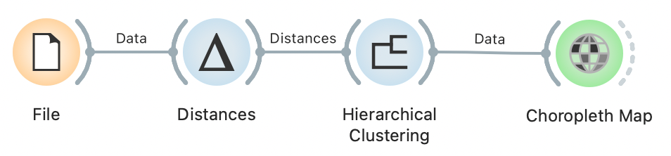
Clustering workflow
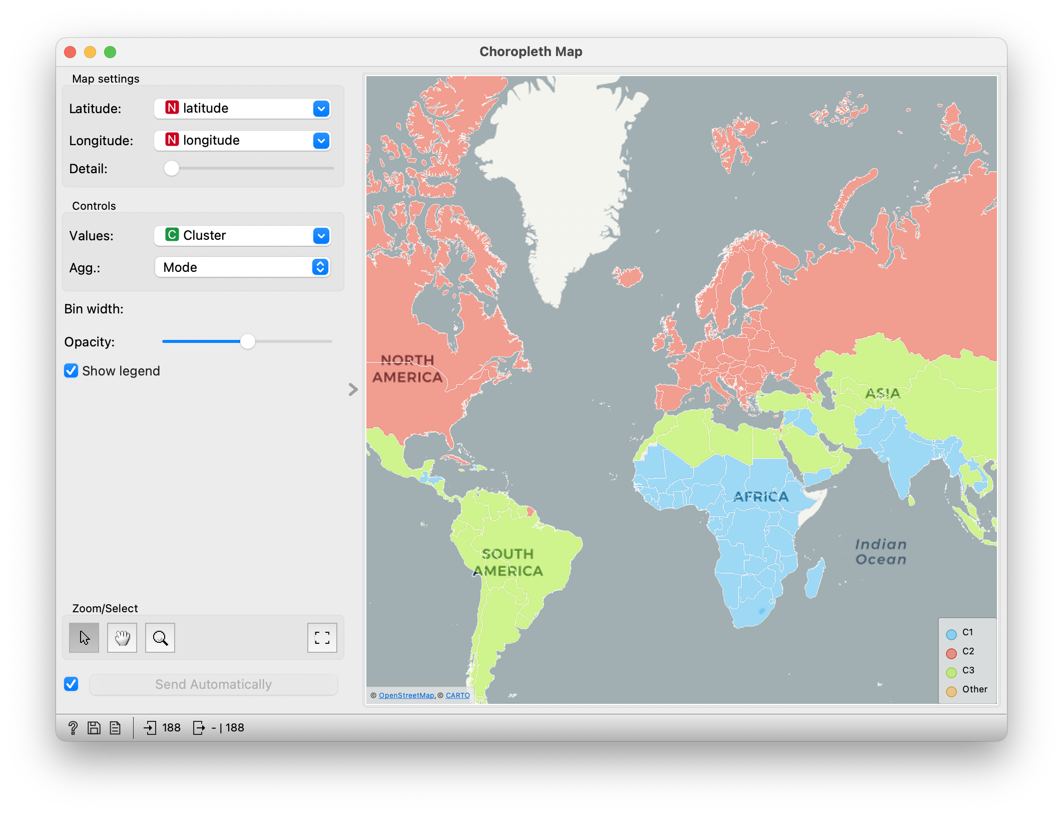
The countries somehow most naturally fall into three groups. One is is composed of European countries, North America, Australia, and a few others. The second one comprises South America, North Africa, and most of Asia. In the third group, we find most of Africa, and the rest of Asia, including - is it really doing that badly? - India. (In the author’s younger days, this was called undeveloped, developed and developing; today’s political correctness cringes a little at that name-calling.)
Countries divided into three groups according to socio-demographic characteristics
Slovenia is in the first group. Since the clustering we do is hierarchical, we can also see how this group divides further.

Subgrouping of more developed countries
The more developed group is divided into two sub-groups, which we could politically and geographically incorrectly call the Western and Eastern countries. Membership in these groups is largely as expected, but it is interesting to look at the Mediterranean countries: Portugal, Spain, Italy, and Greece. They have found themselves in the same cluster, which, in a way, is quite surprising, given that the data includes no information about geography, only about the economy, education, health, and similar. The fact that the cluster knows nothing about geography is evident from the country that has joined them: Cuba! This surprised many people, but not those who know more about Cuba: apart from the debatable state of Cuban democracy, it is a country where - when it is not too hot - living is not actually that bad, at least as far as the criteria described in the data are concerned (education, health, lifespan).
And Slovenia? Interesting: according to these figures, it is most similar to Ireland, and both together are joined, ha, by the Visegrád group. You can see where the other countries are in the picture, but it’s even better if you try it for yourself.
So what did we learn from the workshop? Most of the participants had their first encounter with data analytics and Orange. We hope they saw that neither is a frightful thing. They learnt about a simple clustering algorithm. At the same time, they may have gained some interesting new insights into the world we live in.