Socio-economic characteristics of countries
The activity plan below includes data exploration and visualisation, a discussion on quality of life in different countries, an explanation of distance measures, the hierarchical clustering process and an analysis of its results. In this format, it requires two school hours. In practice, of course, it is adapted to the time available and the objectives to be achieved. In particular, the initial motivation on the subject of length of schooling and life expectancy can be omitted if desired.
Introduction
How many years do students have to go to school? How many years are compulsory - and how many years do we go to school on average? How about in other countries? Is it the same everywhere in the world as in Slovenia? Or where do children not have to go to school? At least not for as long as they have to here? Would you rather live in such a country?
Do we have any data on this?
Observing the data
The World Bank (among others) collects the data needed to answer these questions. It can be found in the Datasets widget. They are located among the English data under the name ‘HDI-edu’. Double-click on them to load or activate them.
Once the data is uploaded to Orange, we link it to the Distributions widget. (Students can only follow this frontally and start using the computers later.) We select the “Mean years of schooling” data and set the width of the bucket to 2 years.
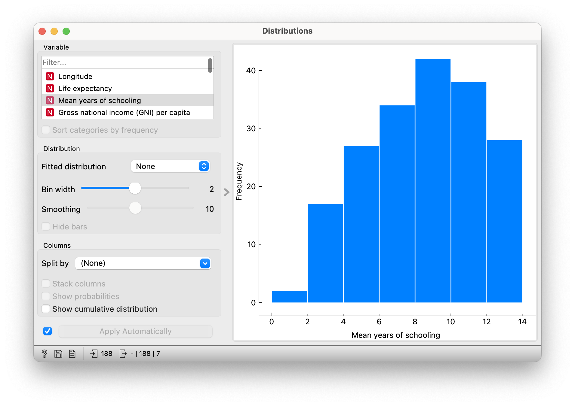
We see that there are countries where the average schooling is less than two years and countries where the average schooling is 2-4 years. Would you live there? Perhaps: which countries are they?
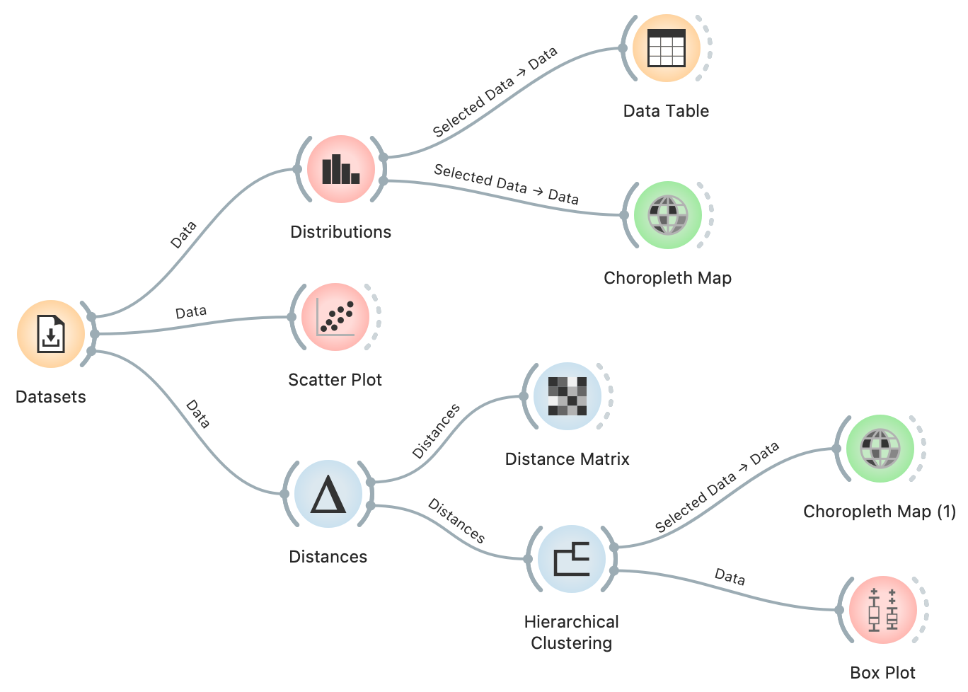
Link the Distributions widget to the Table and to the Choropleth Map. If we now select data in the Distributions, the selected countries are shown in the table and on the map. These are the countries where the average schooling is less than four years.

Here we can test students’ knowledge of the situation in these countries. Are they safe? Are there any particularly bad diseases spreading? What is the situation of women and minorities in these countries?
To illustrate how length of schooling is related to quality of life, we show a scatter plot where the position along the horizontal coordinate corresponds to length of schooling and the position along the vertical coordinate corresponds to life expectancy. A regression line can also be added to see the trend.
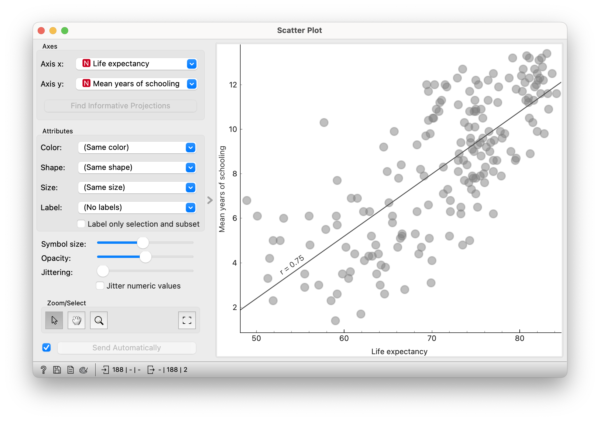
In countries where less time is spent in school, people are dying younger. The link is practically linear: ten more years of schooling means forty years longer life. Would you be willing to go to school for a year longer if it meant living four years longer?
This leads us to the realisation that the education of the population is probably also linked to the general standard of living, such as the quality of the health system. Of course, the relationship does not work on an individual basis: the data are at the level of countries, not individuals. Life expectancy does not depend on how much schooling an individual receives, but on how much schooling is received in each country. At the same time, the link is not causal, it is merely a correlation.
Countries that are similar on one criterion are obviously similar on others.
Similarities between countries
Could we form groups of similar countries?
How do we define “similarity”? Are Slovenia and Croatia similar? And Slovenia and Austria? Try to get students to think not about natural features and geography, but about “how people live” in these countries, i.e. the socio-economic situation. (For example: what about Slovenia and Vietnam? We both have mountains and forests, rivers and sea.) If we were describing a country in terms of its weather, we would say what the highest and lowest temperatures are, how many days a year, on average, it is covered by snow, how many days a year, on average, it rains, etc. How would you describe a country in terms of how its people live? What kind of data could we collect?
The relevant data are the World Bank data, which we looked at superficially in the previous section. Now we show them in a table and quickly go through the variables they contain with the students. This is Human Development Index data, so it contains variables such as life expectancy, unemployment rates, vaccination rates, the number of doctors per thousand inhabitants, gross domestic product, gender equality and so on.
So how would you define the similarity between a pair of countries based on these data? The simplest way is this: for each variable, we look at the difference between the two countries and add up the differences. We need to add up the absolute values, i.e. the magnitude of the difference, irrespective of whether the data is greater for the first country or the second. In addition, we need to be careful about the different scales of measurement: the data need to be normalised so that each variable contributes equally. (More on this in the supporting activity Distances.)
In Orange, distances are calculated using the Distances widget (appropriate setting for this data: Rows, Euclidean (normalised)). This calculates a matrix of distances between all pairs of objects, for example rows. The distances can be observed with the Distance Matrix widget. If we set the labels to Country, the rows and columns will be labelled with the names of the countries. So we can see, for example, that the difference between Qatar and Germany is significantly larger than the difference between Germany and Poland.
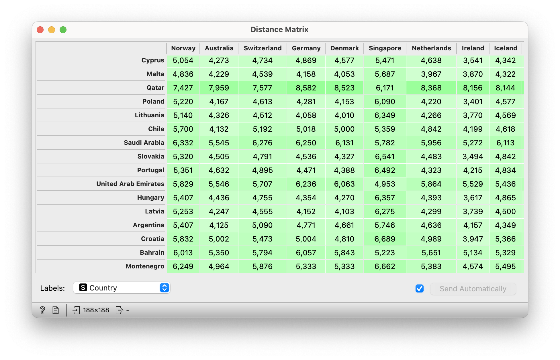
If we have been working in a frontal way, the students need to start working on the computers on their own from here on, so that they can answer the questions later on.
Clustering
Once we have calculated the distances between all pairs of countries, we can form groups. The most practical way to do this is to use hierarchical clustering. This works by starting with each country as a group of its own; so we have as many groups as there are countries. Then, at each step, we group together the two most similar countries or groups. In this way, the groups are merged into larger and larger groups until finally we have all the countries in a single group.
The process can be explained by a kinaesthetic activity in which we form groups of students according to two fictional criteria, for example maths knowledge and football skill. See the supporting activity Hierarchical clustering.
Then drag the data from the Distances widget into the Hierarchical Clustering. We use Ward’s calculation of the similarity between clusters ( Linkage: Ward). We set annotations to Country.
The result is a tree (dendrogram) showing the hierarchy of the country clusters. For greater clarity, the tree can be divided at this point into a reasonable number of clusters by clicking inside the dendrogram.

We ask students to identify the geographical regions to which each cluster belongs.
Hierarchical clustering is linked to the Choropleth Map. For “Values” select “Cluster” and for “Show” select “Mode”. This will colour each country according to the cluster it belongs to.

In hierarchical clustering, we can choose different numbers of clusters and observe how the world is divided in more or less detail according to development.
We observe the dendrogram. Students can then work in groups to answer the following questions.
- Which major group of countries is Slovenia in?
- Which countries are most similar to Slovenia?
- Find the group containing European countries.
- How is it divided?
- Which non-European countries does it contain? Why? (Because we group countries according to socio-economic characteristics, not physical proximity.)
- Are there countries in this group of countries that you would not expect to find in it? (Cuba?)
Analysis of differences between groups
The most important part, from a geography point of view, is observing the differences between groups. To do this, we add the Box Plot. Double-click on the link between the hierarchical clustering and the box plot visualisation, and link the Data output (instead of the Selected Data output) to the input of the Box Plot.
Simply show students an example of a box plot without dividing it into groups, for example, a box plot showing life expectancy. A detailed explanation is not necessary; it is sufficient for them to be able to find the average and to understand that the width of the box represents the variation within the group.
If we select a group in the Hierarchical Clustering (e.g. a cluster containing most of the African countries) and have “Selected data” selected as “Groups” in the Box Plot, we can see how this group differs from the rest of the countries in the world. In the Box Plot, we can select " Order by relevance to subgroups" and we get a list which has at the top the data that differentiates these countries the most. For example, African countries differ from the others in life expectancy, mortality before one year, education …
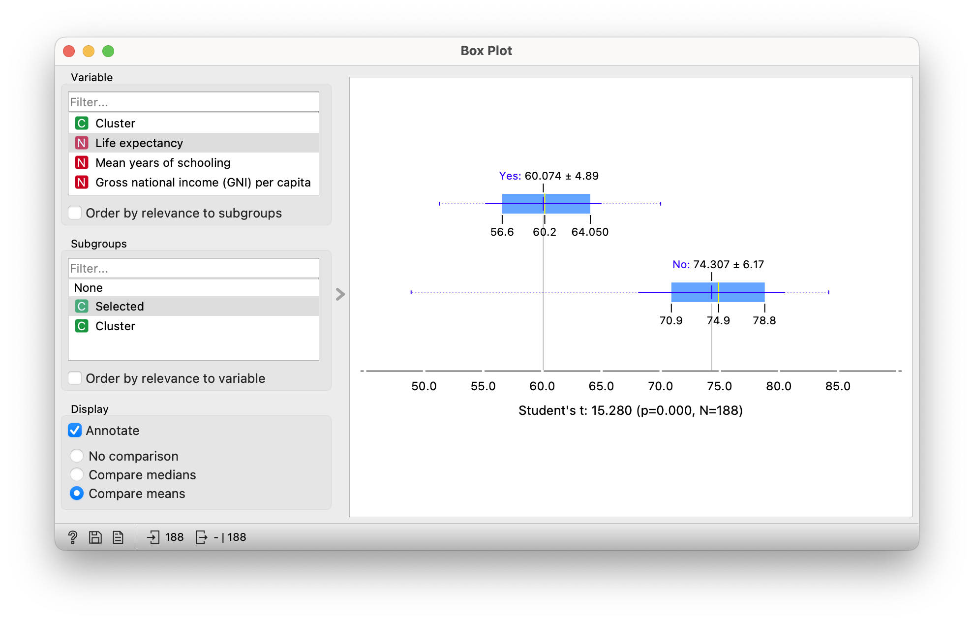
If we instead divide the whole world into clusters (by clicking outside the cluster), we can see how the clusters differ most. Alternatively, you can select two groups (click within one, then press Shift and click within the other group) and then observe the differences between the two groups. To do this, it is more convenient to double-click the link between the hierarchical clustering and the box plot, and again select only the Selected data, so that the remaining, unselected countries do not get into the box plot. This way we can see, for example, what the difference is between the Western and Eastern European group.
You can show students how to use the Box Plot for this group comparison and then give them group work tasks. For example: Find a group of Middle Eastern and North African countries. How are they most different from European countries?
The countries of Central Africa seem to be divided into two groups. What are the differences between them? Which group is better situated?
- Subject: geography
- Duration: 1 - 2 hours
- Age: 8th grade, secondary school
- AI topic: classification
- Materials
- Preparation for the lesson
- computers with Orange and Geo add-on installed
Placement in the curriculum
In terms of geography: students learn that regions differ in their socio-economic characteristics. They learn that countries differ on many objectively measurable criteria, such as life expectancy, number of doctors per 1 000 inhabitants, length of schooling, gender equality, gross domestic product (GDP) and others. Countries in the same region are typically similar to each other. They learn about the differences between the European region and the rest of the world, and also within the European region, and see where Slovenia fits in.
In terms of AI: students learn about the concept of more abstractly defined distance between objects, the clustering process and its representation by a dendrogram. They learn how to compare a pattern using visual methods.
Foreseen necessary widgets of Orange: File, Data Table, Distributions, Distances, Hierarchical Clustering, Choropleth Map, Box Plot
Activity is aligned with the teaching objectives of the subject which include developing students’ knowledge and understanding:
- the main socio-economic systems on Earth (agriculture, human settlement, economy, energy, population and others) to get a sense of place;
- the diversity of people and societies on Earth, in order to appreciate the cultural richness of humanity. The curriculum also states that in geography lessons, students develop the following skills:
- use verbal, quantitative and symbolic data such as texts, pictures, graphs, tables, diagrams and maps (cartographic, numerical and functional literacy);
- collecting and interpreting secondary sources of information and using statistical data.
Among the operational objectives of the 8th grade, students learn about the burning issues of the contemporary world by studying examples from different continents; they form attitudes and values such as respect for other peoples and cultures, international cooperation.