Basketball
Introduction
Young athletes often try out several different sports. But which is the one where they have the best chance of success? Taller students have a better chance of success in basketball than in gymnastics. Based on physical characteristics alone, we can narrow down the sports that are best suited to someone. However, additional measurements are also used to determine an athlete’s potential in the chosen sport or to guide them towards the most appropriate discipline.
Even within a sport, there are multiple disciplines or roles in the case of team sports, which are performed by athletes. We will focus on basketball and the different playing positions, using the example of players in the NBA basketball league, which is becoming more and more visible in Slovenia due to the success of Slovenian basketball players, especially Goran Dragić and Luka Dončić.
- point guard
- shooting guard
- small forward
- power forward
- center
Experience tells us that taller players tend to occupy the positions closer to the basket. Similarly, we would expect more accurate shooters to play in positions further away from the basket. Can we use information on players’ physical characteristics and accuracy of their shots to determine their playing position? One way is to find a player with similar characteristics and look at his playing position. But the question arises, how do we even determine the similarity between two players?
Data
The data can be found in the Databases widget. They are located among the English data under the name ‘NBA Players’. Double-click on them to load or activate them.
We will look at data from the 2022/23 NBA season. For almost 250 players we have data on their playing position, physical characteristics (age, height, weight, playing hand) and playing stats (percentage of 3-pointers made, number of blocks, assists, etc.).

Data is rarely ideal, there is always something missing or wrong. Most of the time in data mining is usually spent on data extraction and preparation. In our case, it is not so bad. We may notice that certain values are missing for the 3-point shooting percentage (3P% variable). We will use the Impute widget to replace these missing values. What do we use? Perhaps with average precision? Presumably these data are missing because these players didn’t shoot for 3 points at all. Probably for good reason, so let’s replace the missing values with 0. At the same time, you can use the Edit Domain widget to edit the variable names so that they are written as full playing position expressions instead of acronyms.
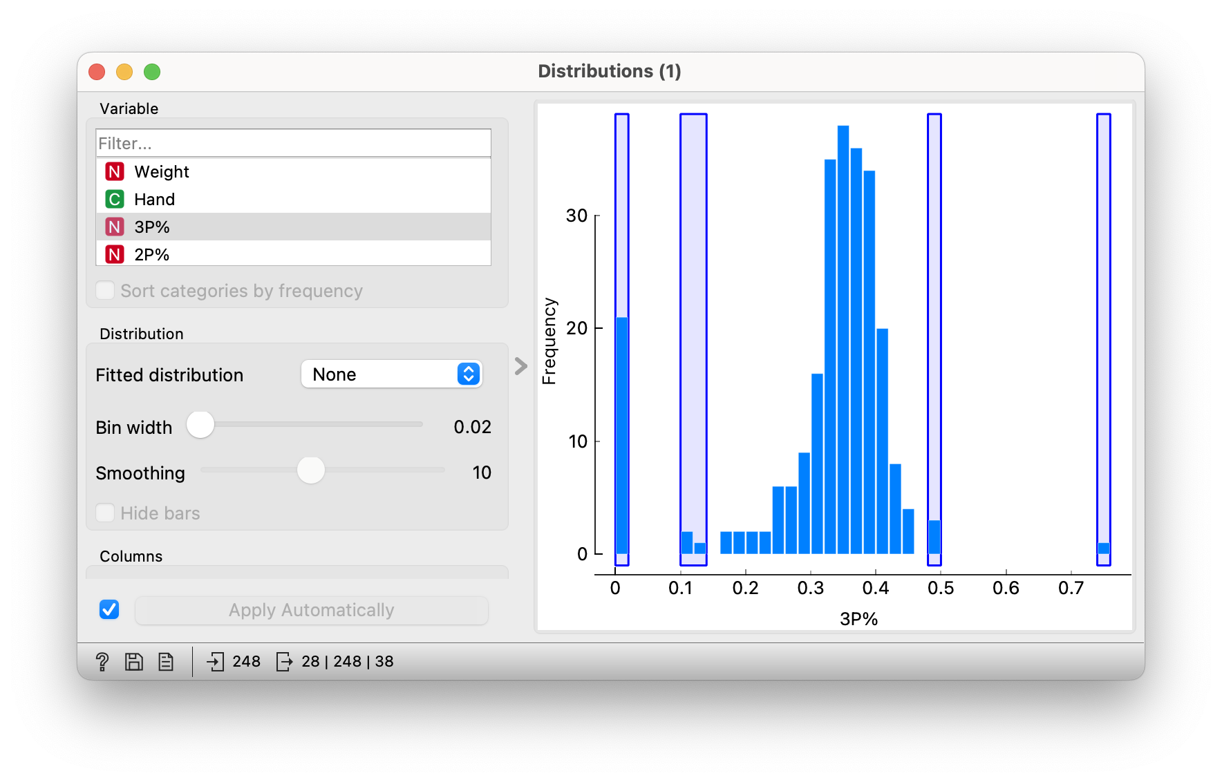
If we now look at the distribution of players’ accuracy on 3-point shots, we see that the average is somewhere between 30% and 40%. However, a few players have a significantly lower or higher average. For the lower averages, we can verify that these are players in the centre positions, who do not take these shots or are less successful at them. Those with higher averages are probably players who shot fewer threes but were very successful. One of them is the well-known Slovenian basketball player Vlatko Čančar.
Groups of players
Let’s try to find groups of players according to their playing positions. Let’s pretend we don’t know the playing positions and try to identify them as best we can from the rest of the data. In the scatter plot, we would like to find a pair of attributes so that players in the same positions are as close together as possible. For example, if we choose the percentage of free throws made (FT%) and the average points per game (PTS), we get a picture where players in different positions are completely mixed up with each other. These two attributes do not tell us much about the playing position, because e.g. high scoring and high free throw percentage can be done by centers, game organizers or other players. We could check all possible combinations of attributes using Find informative projections, or we could use some of our knowledge about basketball. In the figure below we can see the distribution of players according to height and percentage of two-point shots (2P%).

And there’s already a pattern of bigger players playing closer to the basket. Interestingly, you would expect the point guards and shooting guards to have a more accurate shot and therefore a better percentage of two-point shots. However, we see that this is not the case. Are point guards and shooting guards really worse shooters? Centres usually shoot two-pointers from much closer distances and therefore probably have a higher percentage of made shots.
The procedures for finding groups in the data are based on distances between cases. The general aim of these algorithms is to identify groups in such a way that the distances between cases within a group are minimised and the distances between cases from different groups are maximised. So how would you define the distance between two actors? We can use the Euclidean distance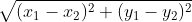
What is the distance between the players at coordinates (208, 0.622) and (185, 0.563)? Approximately 23. The above figure (scatter plot) is a bit misleading, because the scales of the coordinate axes are not the same. The figure should be completely suppressed in height. Compared with the differences in height, these figures on the accuracy of the throws are so small as to be completely negligible and of no use to us in calculating distances; if we were to use height alone, there would be no significant difference in calculating distances. Therefore, when calculating distances, we usually normalise the data - attributes with different ranges of values are converted to equivalent ranges. Now that we have the distance, we can use hierarchical clustering to detect groups.
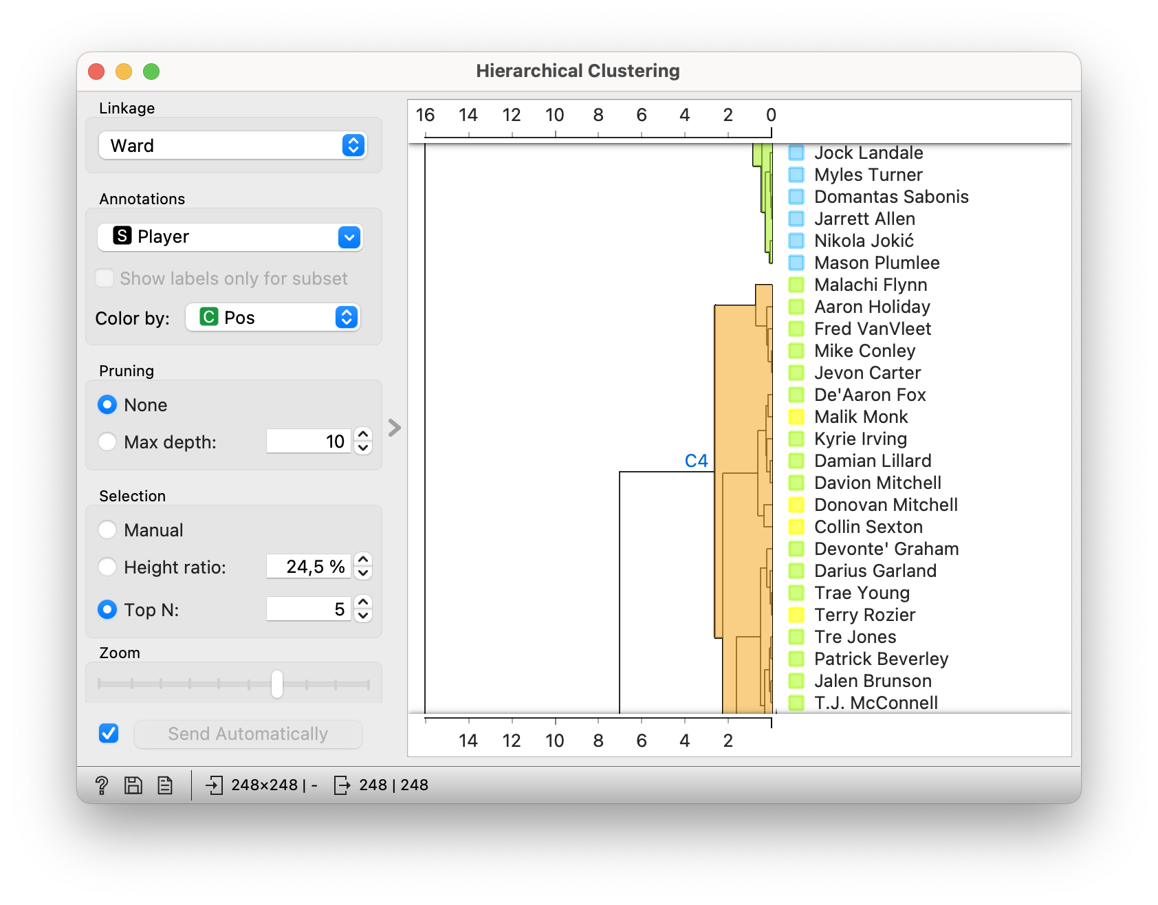
In the dendrogram (visualisation of hierarchical clustering) we see some pure groups where most players belong to the same playing position. In the picture above, we see a group that includes mainly point guards and some shooting guards. Above it we can see a part of the group with mostly centres. However, some groups are still quite mixed. Would the groups be better if more attributes were included instead of just the two selected (height and two-point accuracy)? Not necessarily. By adding useless attributes we affect the distance measures and consequently the detected groups.
Specialisation for a new player
When a new player joins a club, we usually don’t know his playing stats. We might know it and we can use it to help us, but we have to take into account that these stats are from a different basketball league and from playing for a different club. With the Select Columns widget, we restrict ourselves to the physical attributes of the player: height, weight, age and dominant hand. Can we guess the playing position of a player from these attributes? Again, we will use distances to help us. We will guess the most similar players to him and decide on the dominant playing position among them. This is how the nearest neighbours classifier (kNN) works.

We will divide the data into two equal parts (Data Sampler). In one part we will try to guess the playing positions, and in the other part we will use the data to find similar players. If we restrict ourselves to the most similar player (Number of neighbours = 1), we can see in the Predictions widget that this procedure correctly guesses the playing positions of 53% of the players (Classification Accuracy, Accuracy = 0.532). With a little experimentation, we find that with the 5 most similar players, the results are even better, and with 10, we already exceed an accuracy of 60%. Does it make sense to increase this number of neighbours even further, perhaps to 100 or 200? Unfortunately, no.
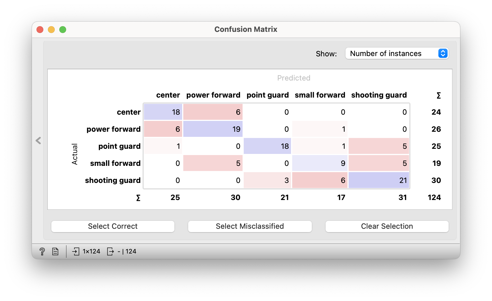
60% accuracy doesn’t sound good, but our way of guessing or predicting is not so bad. Not all errors are the same. If we put a player under the basket in the centre position instead of the point guard position, it is a much bigger mistake than if we replace the point guard with the shooting guard. In the error matrix we can see what errors our classifier made. Sometimes he changed a centre for a power forward, but he didn’t make very radical mistakes. The biggest mistake was that he put one player, who is the point guard, in the position of power forward. That was Luka Doncic, who is unusually big for a point guard in the NBA.
Conclusion
Data is often represented as points in a plane or in a multidimensional space. To analyse them, we use the similarities or distances between pairs of points. To do this, we need to choose an appropriate distance measure. Usually this is the Euclidean distance between points that you are familiar with, but there are others. Whatever distance is chosen, we need to critically evaluate what it is actually measuring and whether it makes sense in the context of the problem we are solving. Mathematics is ubiquitous in machine learning, with vectors, geometry, systems of equations and many other areas of mathematics.
- Subject: mathematics
- Age: 2nd year
- AI topic: nearest neighbours, distances
- Materials
Placement in the curriculum
In terms of mathematics: students learn the basics of statistics in observing distributions and interpreting data. They also consider different possible definitions of the distance between points in a plane or in space.
In terms of AI: Students encounter several examples of processing or preparing data for analysis. They use visualisations to look for patterns in the data. They use the patterns they detect to discover clusters by clustering and to design a simple classifier using nearest neighbours. They critically reflect on the distance measure used and interpret the performance of the classifier.
Foreseen necessary widgets of Orange: Datasets, Data Table, Edit Domain, Impute, Distributions, Scatter Plot, Distances, Hierarchical Clustering, Select Columns, Data Sampler, kNN, Predictions, Confusion Matrix
Activity is aligned with the teaching objectives of the subject:
- develops abstract-logical thinking and geometric concepts,
- uses ICT to help solve problems,
- encourages critical interpretation of data and results,
- encourages expression in mathematical language.